A View of the Kitchen and Dining Area
We’ve been in our new house about a month now and it is quickly becoming home. I’m still working on little things, and there are larger projects that await, but we are very pleased with the rate and progress we’ve made in settling in.
In this post, I shared the photos of our new living room. I absolutely love it! And my extroverted husband loves it because there are nine seats readily available, with more room to add temporary seating for even larger groups. I keep getting comments that it looks warm, inviting, and beautiful, which is encouraging since it was my intent.
As I mentioned in the living room post, the living room, dining room and kitchen are combined in an open concept rectangle. Seriously, if Joanna Gaines walked into our house, there would be no walls for her to take out.
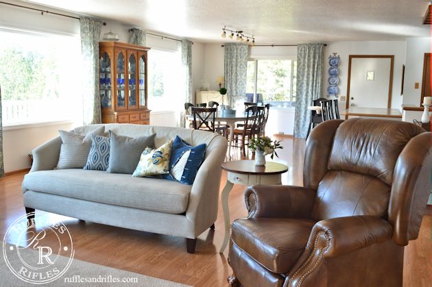
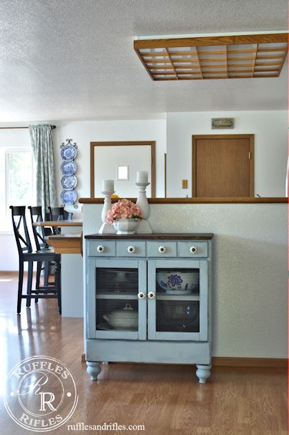
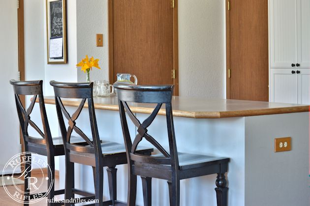
About twenty years ago my mother-in-law remodeled the kitchen to make it a more functional set up. She had the cabinets done in a medium oak (especially around the island to hide any stray feet marks from bar stools) and then the faces of the bead board were professionally painted and antiqued in a dusty country blue. They were pretty and in incredible shape after all those years, but they just weren’t me.
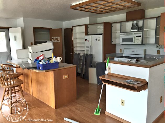
I didn’t get a good before shot of the kitchen. Since we had two days to literally flip the upstairs, the second the renter was moved out, my husband was removing cabinet doors and we were cleaning.
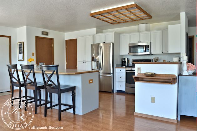
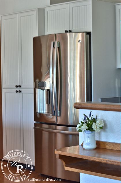
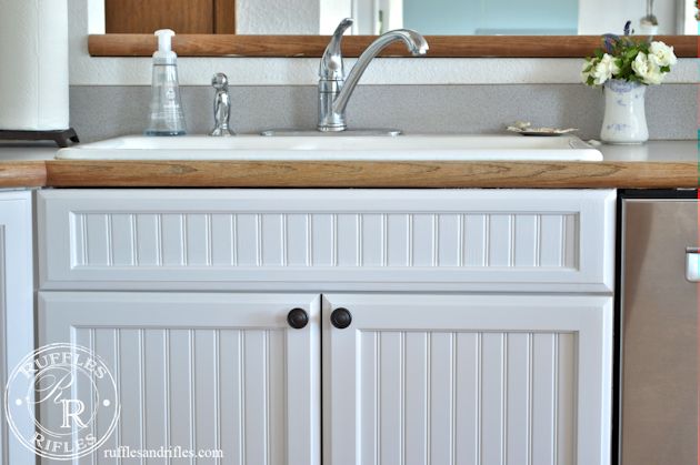
Because of all the bead board, we also opted to have the cabinets professionally painted. While my first choice of cabinet face would be a glazed French country look, I think the farmhouse bead board is my second choice. So for now, a painting option is also the most economical option for updating.
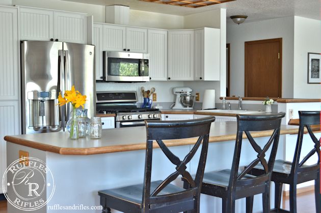
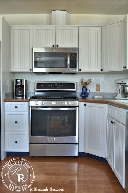
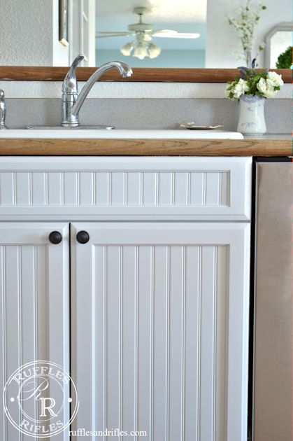
The cabinets were primed with oil-based primer and brushed on, while the faces had the same layers and were sprayed to get that smooth look on the bead board. I couldn’t be happier with the result. I chose Sherwin Williams cabinet enamel, in Snowbound for the wrap-around cabinets by the wall, and Pussywillow (a warm grey) for the island. I love the contrast, and I’m hoping the grey around the island will hide a bit more of the dirt and grime than a stark white would have.
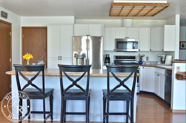
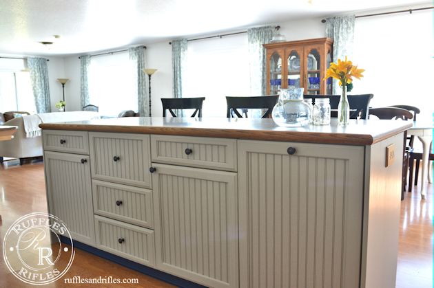
I also had to get new knobs. I really liked the white ones, but they weren’t right for the new look (I can assure you I will be repurposing them in other projects). I knew I wanted oil rubbed bronze, but they are so expensive at Home Depot or Lowes. I ended up ordering these from Amazon, and am very pleased with them. They’re heavy duty and are a fraction of the cost, and they look perfect.
I love the new kitchen. It is so much larger than our last! The work space is incredible! The island is amazing! I love the layout and the organized storage, not to mention two, and I mean two pantries! Someday, I envision those plain wood doors being changed out for old doors with lots of character and patina.
We were not planning on getting new appliances before we moved in originally. But the oven was broken as was the dishwasher. So we had to get at least two, and though it wasn’t in our original budget, we had the money to go ahead and get a matching fridge and over the hood microwave. They are beautiful I could do a review on them sometime. I am very pleased with the oven and stove (it has five burners and a griddle in the middle — so practical for a larger family), and the fridge was a floor model and a good deal because it was a floor model. It’s also huge, and I love it. They were all GE Profile pieces. We got a Bosch dishwasher, which is a dream — it has three drawers and cleans like nothing else.
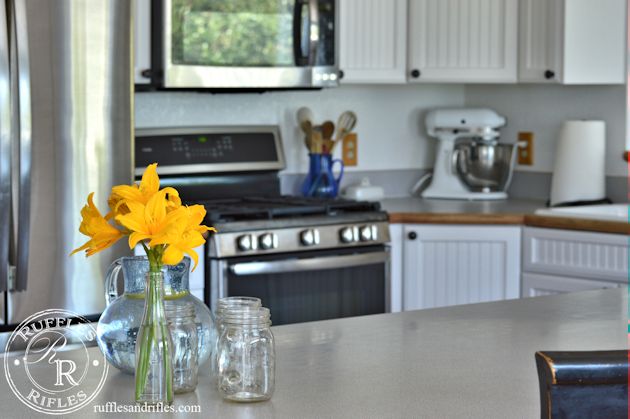
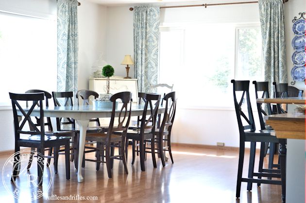
And then the dining area. It is so light and bright. I had every intention of repainting our table this summer, but when we brought it in, it was like the blue was made for this space! I love it!
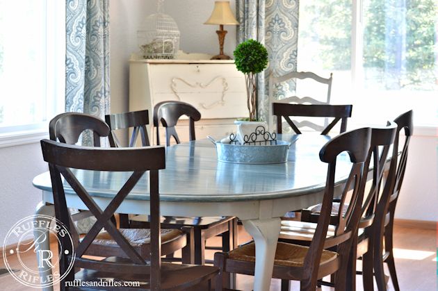
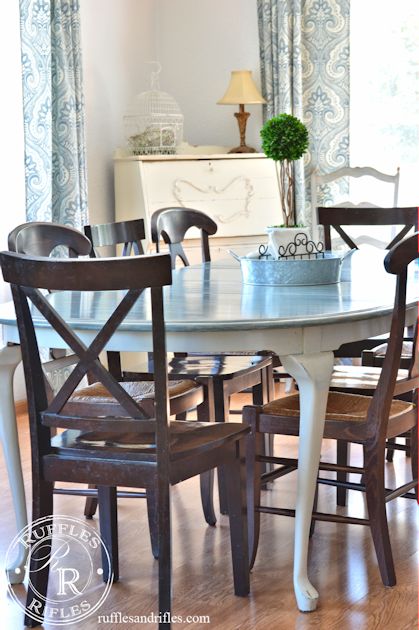
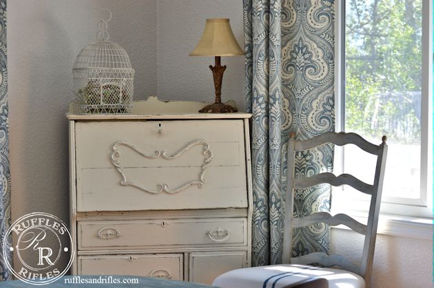
There is plenty of space to tuck the secretary desk in the corner. I can work on my blog and still be in the midst of my family which I love.
So, while I’m incredibly pleased with this space, there is a list of things yet to be done. I would like new countertops, I’m leaning towards quartz — and getting a marble look without the care and maintenance of Carrera marble. I would love herringbone Carrera marble backsplash (swoon). And a stainless steel under mount sink (again, white sinks are pretty when they’re installed, but to keep them clean is rather a nightmare).
Also, the fan you see in the entry way is being replaced.
We have a new chandelier to be installed above the dining table. Someday I would like to find some old doors for the pantry. Also, the blue cove base around the bottom of the cabinets needs to go. I would love canned lights in the kitchen and a pair of small chandeliers for over the island, but that’s way down the road. And, I need to repaint the bar stools, I’m still debating what color(s) and yet practical family function to go for. But for now the space is amazing.
I am so incredibly thankful.
Thanks for stopping by!
Cheryl


4 Responses to A View of the Kitchen and Dining Area